


Hey Floral Babes
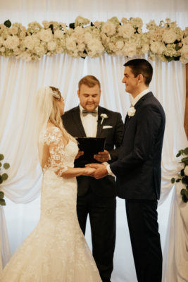
Recently, I had the honor of designing a monochromatic wedding.
Now, if you are familiar with my work, you know I am a queen for color.
I LOVE BRIGHT COLORS!! Have you ever seen a raspberry ranunculus?
HELLOOOOOO GORGEOUS!
When discussing the bride’s color palette and her design aesthetic, I could instantly see the look she was going for. Clean, classy, with a touch modern. Shawna, my sweet, sweet client wanted only white flowers for her wedding.
For those who may not know this, a monochromatic color scheme is by definition:
“Monochromatic color schemes are derived from a single base hue and extended using its shades, tones and tints” -Wikipedia
Essentially, you are using one color as your base and then using hues of that color to streamline a calmness to the design.
For instance, in a white monochromatic design, you may use shades milk white, cream, silver or gray to accent the white, as well as metals or shine to accentuate the pureness of the white color.
I observed a few things while working with this palette.
1. It was extremely calming to myself and staff.
While designing with an all-white palette, it had a very calming effect on our moods. Every stem seemed so clean and perfect.
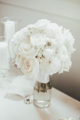
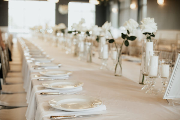
For product: I chose scabiosa, playa blanca roses, tulips, stock, dahlias and ranunculus. Because I was using an all-white palette, it was important that I played up product shape & texture.
2.It was easy to find Unity + Harmony in my designs.
It was very important to Shawna that her guests be present at her wedding.
In today’s technology driven society, it is so easy to get wrapped up in the social media feeds. I can understand why many couples post signs asking guests to be “unplugged” for their ceremony and wedding. Asking them to simply enjoy the moment.
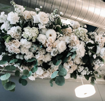
When working with Shawna + Ryan, I suggested creating hanging installments or above their guest’s tables. This would draw their guests eyes up rather than down to their phones. We placed the hanging installments through the walkways for the guest tables. I wanted the guest to walk underneath the installments to see the different product. We hung them at about 11 feet so they were low enough to walk under it without fear of hurting any decor.
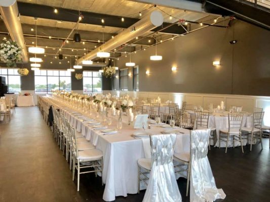
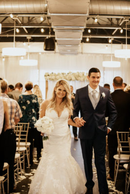
On the tables were collections of clear glass votives with white candles, white linens and silver chairs provided by The District Venue in Ankeny, IA. The venue is very industrial with clean lines and large windows to bring in natural light.
#3 Created a timeless ambience.
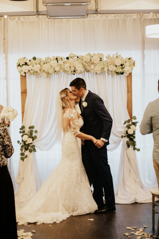
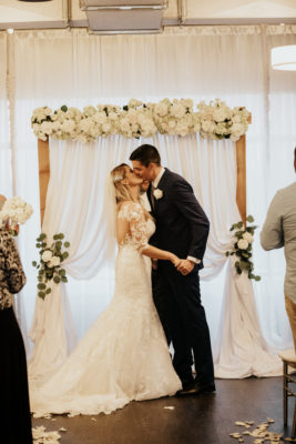
I noticed that the white color scheme made the class votives seem brighter and shinier with the lack of any competing colors. The glow of the candles seemed extra bright. In uniform with a monochromatic theme, we lined their kings table with clusters of largely bloomed playa blanca roses. We chose to streamline the same product down the aisle to keep the simplicity of the palette.
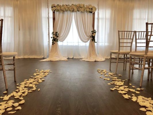
Of course, we chose an all-white arch with white drapes and white rose petals lined the aisle. As a designer it was easy to streamline the clean nature of the color scheme and elegance of the event.
My advice if you are stuck on what palette to use in wedding work, to start simple. Find a color you love, and then build from that color hues and tints. I loved creating the florals for this wedding and I would love to do something like this again.
Thank you to Ryan and Shawna Campbell for choosing Pretty Petunia as your event florist.
Sarah
